Best Sci-Fi Movie Fonts (2026): The Typefaces Behind the Future
- The defining font: Eurostile, the wide squared sans that read as machined and made the genre's baseline vocabulary.
- What actually works: squared-geometric sans for hardware sci-fi; bespoke lettering for prestige blockbusters.
- Skip: glowing chrome-bevel "tech" fonts; they read as 1990s screensaver, not 2026 future.
Table of contents
- What font is used in 2001 and the squared-sans era?
- Which font families define sci-fi typography?
- Which sci-fi fonts win by use case?
- How do sci-fi looks split by sub-genre?
- What about cyberpunk and retro-future typography?
- Which sci-fi fonts can you actually license?
- How is AI changing sci-fi title design?
- Frequently asked questions
Science fiction is the genre most committed to making typography do worldbuilding. The font on a spaceship console and the font on the poster are arguing the same case: this future is plausible, and it has a design language. Where horror leans on dread, covered in our horror font breakdown, sci-fi leans on the machined and the engineered. This roundup traces the best sci-fi movie fonts to the films, ranks them by use case, and tells you which ones you can license. To price a specific cut across tiers, our Font Licensing Calculator runs it in one pass.
What font is used in 2001 and the squared-sans era?
The genre's baseline font is Eurostile, the wide squared-off geometric sans drawn by Aldo Novarese in 1962. Eurostile reads as machined because its forms are based on the rounded rectangle, the shape of a mid-century television screen or a riveted hull panel. That association is why it spread across spacecraft interfaces, control-panel labels, and titling through the 1960s and 1970s, and why it still signals hardware sci-fi instantly.
Eurostile is the squared-sans archetype, but it has a family of relatives the genre reaches for: Microgramma (its all-caps predecessor), Bank Gothic, and the contemporary squared cuts that show up across modern sci-fi UI design. The common thread is the squared geometry; the genre treats curves as organic and corners as engineered. The design-history record at Fonts In Use tracks where these faces actually appear across decades.
The squared-sans look became so dominant that it now functions as visual shorthand. Drop Eurostile or Bank Gothic onto almost any image and a viewer reads "technology," "future," or "spacecraft" instantly, with no other cue required. This is enormously useful for a creator on a budget, because the typeface does the worldbuilding for free, but it is also why prestige films avoid it: a look that everyone can summon for nothing is a look that confers no distinction. The genre's two paths, off-the-shelf squared sans and bespoke lettering, are really a single trade-off between instant recognizability and earned distinctiveness.
It is worth noting that Eurostile's sci-fi association was partly an accident of timing. Novarese designed it as a general-purpose modern sans in 1962, not as a science-fiction face; the genre adopted it because its rounded-rectangle forms happened to echo the screens, panels, and hardware that mid-century futurism imagined. The meaning was assigned by use, not by the designer, which is the same way Trajan became "prestige" and ITC Serif Gothic became "horror." Typefaces acquire genre meaning through repetition, and once acquired, the meaning is hard to shake.
Eurostile
The machined default. Squared geometry, instant spacecraft association, licensable per weight.
Squared OFL sans
Free squared-geometric cuts get most of the Eurostile look with no purchase.
Bespoke lettering
Alien, Blade Runner, Dune: the biggest films draw custom title type.
Which font families define sci-fi typography?
Sci-fi typography clusters into three families, and a capability matrix is the cleanest way to compare what each one delivers.
| Family | Machined feel | Licensable | Holds in motion | Defining film |
|---|---|---|---|---|
| Squared geometric sans (Eurostile) | Strong | Yes | Yes | 2001-era sci-fi |
| Thin tracked geometric | Cool, clinical | References only | Needs care small | Alien (bespoke) |
| Bespoke display lettering | Bespoke | No | Yes | Blade Runner, Dune |
| Humanist sans (soft future) | Warm future | Yes | Yes | Her, Arrival |
The humanist-sans row is the modern surprise. Films imagining a warmer or nearer future, Her and Arrival among them, deliberately reject the squared-machine vocabulary for soft humanist type, because the story's future is intimate rather than industrial. The font choice is an argument about what kind of future the film believes in.
This is the most sophisticated idea in sci-fi typography: the typeface encodes the film's thesis about technology. A hard-SF film that believes the future is engineered and a little cold reaches for squared sans. A near-future film that believes technology will be intimate and human reaches for soft humanist type. A dystopian film that believes the future is corporate and oppressive reaches for cold institutional sans or aggressive condensed display. The audience reads the thesis before the plot delivers it, which is why a thoughtful sci-fi title is doing argument, not decoration.
What about cyberpunk and retro-future typography?
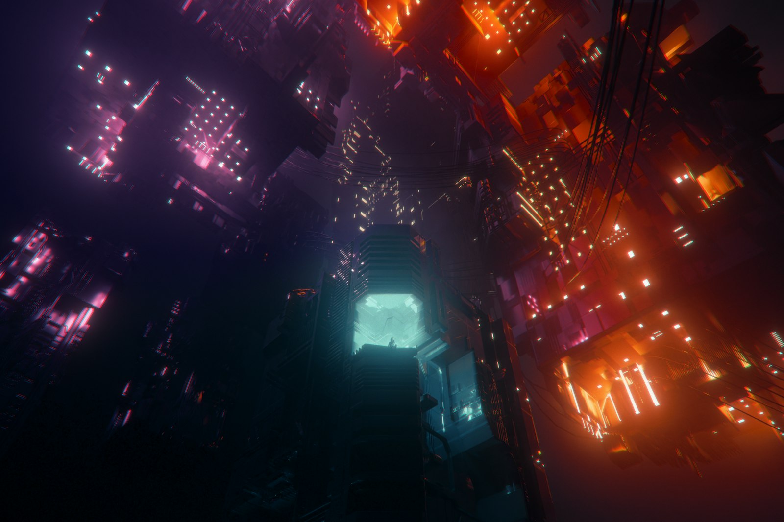
Cyberpunk is the sci-fi sub-genre with the most distinctive typographic signature, built on the collision of high technology and urban decay. The look mixes neon-sign scripts, dense Japanese-influenced layouts, glitch and distortion effects, and cold corporate sans, all at once, because the aesthetic is fundamentally about overload. Blade Runner set the template with custom lettering and a polyglot signage environment, and the cyberpunk revival across the 2010s and 2020s has leaned into glitch-display faces and monospaced terminal type.
Retro-future, sometimes called retrofuturism, is the inverse: it depicts the future as an earlier era imagined it, so it reaches for the squared sans of the 1960s and 1970s, chrome-bevel display, and the optimistic space-age vocabulary. The two sub-genres pull in opposite directions, cyberpunk toward dystopian overload and retro-future toward nostalgic optimism, and the typeface is the fastest way a film or a creator signals which one they are making.
For a creator, both looks are achievable with licensable or free type plus treatment. Cyberpunk leans on monospaced and glitch-display faces, many available under the SIL OFL, finished with neon glow and distortion in post. Retro-future leans on squared geometric sans and chrome effects. The risk in both is the same generated-cliche problem: the more available the look becomes, the faster it dates, so the durable move is a considered, restrained version rather than every effect at once.
How do sci-fi looks split by sub-genre?
Sci-fi is not one look; it is several, split by sub-genre. The tabbed breakdown below sorts them.
Hardware sci-fi is the squared-sans home turf. Eurostile, Microgramma, and squared relatives label the consoles and set the titles. The look says the future is engineered, riveted, and operable. Reach here for space-station, military, and hard-SF stories.
Soft and near-future sci-fi rejects the machine vocabulary. Humanist sans like the cuts behind Her and restrained contemporary serifs carry an intimate, plausible-tomorrow tone. The future here is emotional, not industrial, and the type follows.
Prestige blockbuster sci-fi almost always commissions bespoke lettering. Blade Runner, Dune, and Interstellar draw custom title type so nothing else looks like them, the same auteur logic A24 applies in our A24 typography breakdown.
Which sci-fi fonts can you actually license?
The licensable sci-fi canon centers on Eurostile and its squared relatives, because the most iconic titles are bespoke. Eurostile is sold per weight on MyFonts and bundled in Adobe Fonts, and free squared-geometric sans options exist under the SIL OFL for creators who want the machined look without a purchase. For where each marketplace sits on price and coverage, see our marketplace comparison, and for the tier mechanics of using these in video, our license-tier guide.
Check the per-weight cost across desktop, video, and broadcast tiers.
Run my license check →How is AI changing sci-fi title design?
AI typography tools are accelerating the bespoke-lettering route that prestige sci-fi has always preferred. Generative type tools can now produce squared-geometric and custom-display variants in minutes, which lowers the cost of the per-project custom look that used to require a dedicated letterer. We track these tools in our best AI typography tools roundup, and our sister desk Nesyona covers the broader AI-tool landscape for creators.
The risk is homogenization: when everyone can generate a "futuristic" font in seconds, the generated look becomes its own cliche, the way chrome-bevel tech fonts did in the 1990s. The defensible move stays the same one the genre has always rewarded, a deliberate, considered choice rather than a default reach.
There is a longer-term shift worth naming. For most of cinema history, bespoke title lettering was the privilege of films with the budget to hire a letterer or a title-sequence studio, which is why the squared-sans default existed: it was the affordable way to look futuristic. Generative type tools collapse that cost, which means a small creator can now reach for the custom-letterform route that used to belong to Blade Runner and Dune. The barrier moving from budget to taste is genuinely new, and it rewards creators who have studied what makes a sci-fi title work rather than those who can simply afford one.
The enduring craft principle cuts across all of it. A sci-fi title succeeds when the typeface argues the film's thesis about technology, whether the type is a 1962 squared sans, a bespoke 1982 letterform, or a 2026 generated cut. The tool that makes the type has changed three times; the question the type has to answer, what kind of future is this, has not. A creator who starts from that question and works backward to the typeface will out-design one who starts from a font menu, which is the same lesson the genre's best title sequences have always taught.
The Marquee, weekly
One email a week. New title-design pieces, a licensing watchlist, and the AI typography tools worth watching.
Frequently asked questions
What font is used in 2001: A Space Odyssey?
The marketing and much of the era's sci-fi reaches for Eurostile, the wide squared-off geometric sans by Aldo Novarese. Its rectangular forms read as machined and futuristic, which is why it became the default vocabulary for spacecraft interfaces and sci-fi titling across the 1960s and 1970s.
What is the most common sci-fi movie font?
Eurostile and its wide squared-sans relatives are the most recurrent sci-fi typefaces, because the squared geometry reads as machined and technological. Modern blockbuster sci-fi increasingly uses custom letterforms instead, but the squared-sans family remains the genre's baseline vocabulary.
What font is the Alien movie logo?
The Alien title is custom display lettering, not an off-the-shelf font, defined by the slow tracking-in of the thin geometric letters in the opening title sequence. The closest commercial reference points are wide geometric sans cuts, but the Alien title itself is bespoke and not licensable.
What sci-fi font can I actually license?
Eurostile is the most defensible licensable sci-fi typeface and is sold per weight on MyFonts and bundled in Adobe Fonts. Free squared-geometric sans options exist under the SIL Open Font License for creators who want the machined look without a purchase. Bespoke film titles like Alien or Blade Runner are not licensable.
What to read next
Sources
- MyFonts. Eurostile. myfonts.com verified 2026-05-29
- Fonts In Use. Eurostile in use. fontsinuse.com verified 2026-05-29
- Art of the Title. Title sequence archive. artofthetitle.com verified 2026-05-29
- SIL International. SIL Open Font License. openfontlicense.org verified 2026-05-29