Best Fonts for YouTube Thumbnails (2026): Cinema-Grade Picks
- Best overall: Anton, free under the SIL OFL, holds at feed-preview size better than any paid display sans.
- What matters: legibility at 168 by 94 pixels and a clean commercial license beat "cool" every time.
- Skip: thin geometric sans and distressed display faces; they vanish at the size the click is actually decided.
Table of contents
- What font do most YouTubers use on thumbnails?
- Which thumbnail fonts hold up at small size?
- How do the top thumbnail fonts compare?
- Where do popular thumbnail fonts fail?
- Do thumbnail fonts need a special license?
- How should you pair a thumbnail font with a channel identity?
- How do you test a thumbnail font before committing?
- Frequently asked questions
A YouTube thumbnail is decided in the feed at a size most creators never design for. The image you upload is 1280 by 1080 pixels, but the click happens against a roughly 168 by 94 pixel preview on a phone. The font that wins at full size and the font that wins at thumbnail size are frequently not the same typeface. This roundup ranks thumbnail fonts the way a title-card designer ranks them: legibility under compression first, license clarity second, channel identity third. If you want to model the cost of a specific paid cut across usage tiers before committing, run it through our Font Licensing Calculator first.
What font do most YouTubers use on thumbnails?
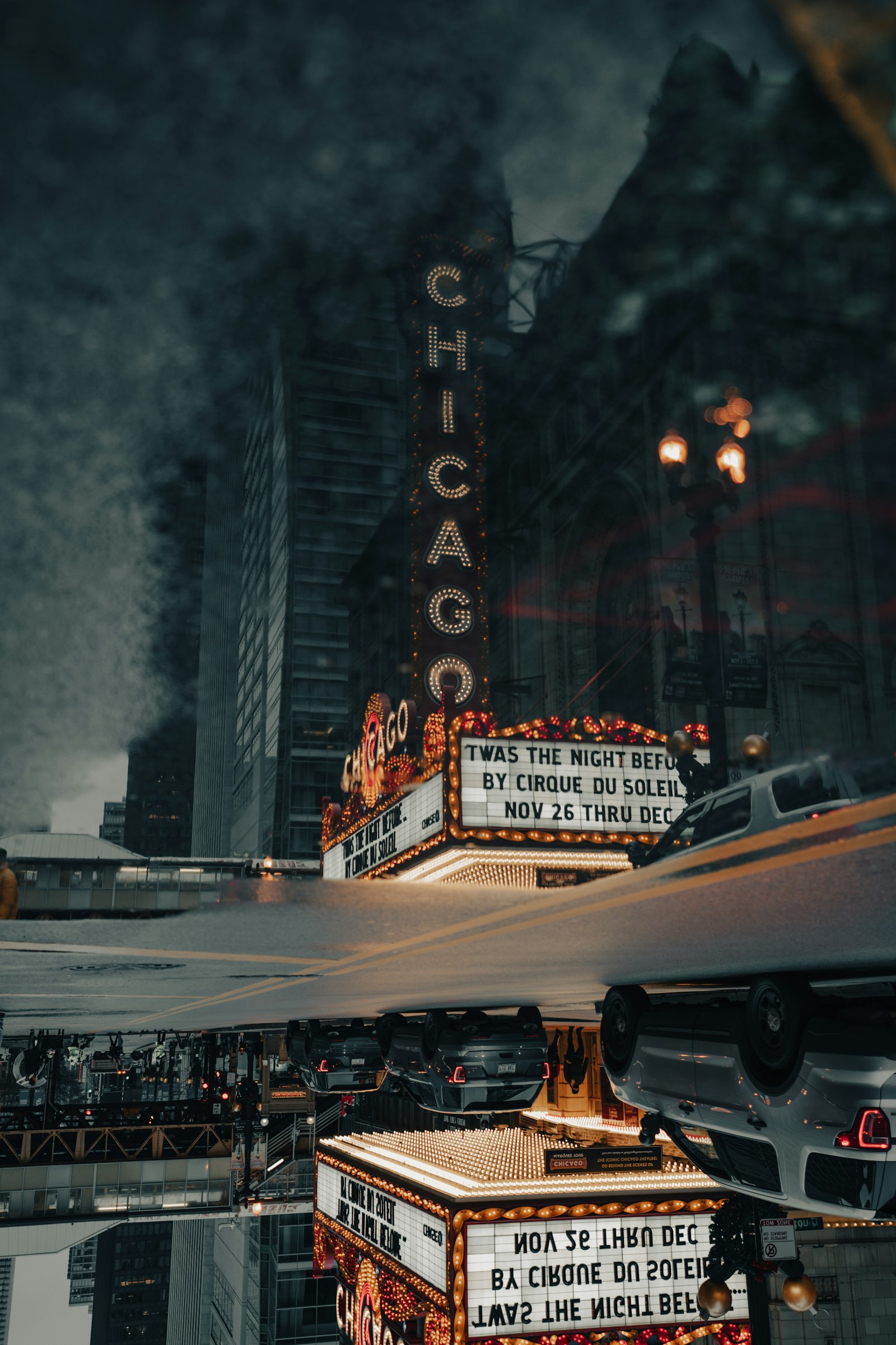
The dominant YouTube thumbnail font is a heavy condensed sans-serif. Across the largest channels, three faces recur: Bebas Neue, Anton, and Montserrat in its ExtraBold weight. The reason is mechanical, not fashionable. A condensed face packs more legible word-mass into the narrow horizontal band a thumbnail allows, and a heavy weight survives the downscale to feed-preview size where lighter strokes alias into mush.
This is the same constraint a poster designer faces, scaled down. A theatrical one-sheet is read from across a lobby; a thumbnail is read from a thumb's width away on a screen. Both reward high stroke contrast against the field and punish delicate type. The faces below are picked against that constraint, and the WCAG contrast-minimum guidance of 4.5 to 1 is a useful floor even though a thumbnail is not a web-accessibility target.
Which thumbnail fonts hold up at small size?
Anton
Best overall. Black-weight grotesque, brutal legibility at any size.
$0 · SIL OFL
Bebas Neue
Best all-caps. Tall, narrow, neutral; the default for a reason.
$0 · SIL OFL
Montserrat ExtraBold
Best mixed-case. Geometric, professional, education and finance.
$0 · SIL OFL
Druk Wide (paid)
Best premium. The condensed-wide cut behind a lot of prestige editorial.
~$199 per style verified 2026-05-29
Anton is the pick because it is a single black weight engineered to be loud. There is no light cut to choose wrong, no optical-size trap, and the SIL OFL license means it is cleared for monetized commercial video with zero per-view math. SIL OFL is the quiet hero of creator typography: it removes the licensing anxiety that drives most of the traffic to our Helvetica licensing piece.
Bebas Neue earns its place as the all-caps default, but the word "default" is doing real work in that sentence. Because the face appears on a vast number of thumbnails, a design-literate viewer reads it as the safe choice, which is fine if your goal is clarity and a problem if your goal is standing out in a crowded niche. The tall narrow cap-only forms pack a three-word phrase into a tight band beautifully, and the uniform stroke survives downscaling, but the lack of lowercase removes a tool: you cannot soften a long phrase with mixed case. For a channel in an oversaturated category, Bebas Neue is a sign you are doing what everyone else does.
Montserrat in ExtraBold is the mixed-case answer and the most professional-reading of the free picks. Its geometric construction lends an editorial, finance-and-education tone that reads as credible rather than loud, which is exactly right for explainer and tutorial channels where trust matters more than shock. The trade-off is that geometric sans needs more weight and a tighter crop to survive the feed-preview downscale than a condensed face does, so reach for ExtraBold or Black, never the regular weight, on a thumbnail. The reference points across all three picks come from the Google Fonts catalog, which is the single largest source of OFL-cleared display faces.
How do the top thumbnail fonts compare?
A capability matrix is the fastest way to read the trade-offs. The columns that matter for a thumbnail are small-size legibility, whether the face works mixed-case or only all-caps, the license status, and how distinctive it is versus how overexposed.
| Font | Small-size legibility | Mixed-case | License | Distinctiveness |
|---|---|---|---|---|
| Anton | Excellent | All-caps best | Free OFL | Common but clean |
| Bebas Neue | Excellent | All-caps only | Free OFL | Overexposed |
| Montserrat ExtraBold | Strong | Yes | Free OFL | Overexposed |
| Oswald | Good | Yes | Free OFL | Moderate |
| Druk Wide | Excellent | All-caps best | Paid ~$199verified 2026-05-29 | High |
| Archivo Black | Strong | Yes | Free OFL | Moderate |
The pattern is clear. The free OFL faces cover almost every need; the only reason to pay is distinctiveness. A channel that wants to look unlike every other channel reaches for a paid cut like Druk or a foundry release, and that is a deliberate identity decision, not a legibility one. For the marketplace math behind paid cuts, see our marketplace comparison.
Archivo Black deserves a note because it is the underrated free pick. It gives you a heavy grotesque with full mixed-case support, sitting between Anton's all-caps brutality and Montserrat's geometric polish. For a creator who wants stopping power but needs lowercase for a longer phrase, Archivo Black is frequently the better tool than either, and it is the same OFL-cleared zero-cost path. Oswald rounds out the set as the refined condensed option: it reads as a slightly more upmarket Bebas Neue with usable lowercase, which makes it strong for channels mixing an uppercase headline with a mixed-case subhead on the same thumbnail.
The deeper lesson from the matrix is that legibility and distinctiveness pull in opposite directions among the free faces. The most legible options are also the most common, which means a creator in a crowded niche faces a real choice: accept the overexposed-but-safe face, or pay for distinctiveness. The cinematic answer, the one a title designer would give, is that distinctiveness is worth paying for only once you have a channel identity worth protecting. Before that, ship the free face and spend the energy on the photograph behind the type, which moves the click more than the typeface does.
Where do popular thumbnail fonts fail?
Every thumbnail font has a failure mode, and most bad thumbnails are a font used outside its zone. Naming the failure modes is more useful than naming more fonts.
Bebas Neue
- All-caps only; no lowercase to soften a long phrase
- So common it signals "default" to design-literate viewers
- Uniform stroke flattens at very small sizes against busy art
Thin geometric sans
- Light weights alias to gray fuzz at feed-preview size
- Counters fill in when the image is JPEG-compressed
- Needs a heavy stroke or outline to survive at all
Distressed / display faces
- Texture reads as noise once downscaled
- Slows the read; the click window is under a second
- Better for the in-video title than the thumbnail
Model the real cost across YouTube, TikTok, and broadcast tiers before you buy.
Run my license check →Do thumbnail fonts need a special license?
A thumbnail font almost never needs a broadcast or video license. The thumbnail is a flattened raster image, so the font is used as a static graphic asset, which is settled by a desktop license or a free OFL release. The broadcast license tier only enters the picture when live font software renders inside the video stream itself, which a baked-in PNG title does not do.
This is the cleanest part of creator licensing and the most over-worried. Google Fonts ship under the OFL, Adobe Fonts cover thumbnails under any active Creative Cloud plan, and a one-time MyFonts Desktop license covers the static-graphic use for a paid cut. For the full tier breakdown of when you actually do need to pay up, read our desktop vs webfont vs broadcast license guide.
How should you pair a thumbnail font with a channel identity?
Channel identity is a typographic system, not a single font. The strongest creator brands run one heavy display face for the thumbnail headline and one neutral face for everything else, in the same way A24 runs a deliberate type vocabulary across its catalogue. We documented that discipline in our A24 title typography breakdown; the takeaway scales down to a channel.
For a creator the system is two faces: a black display cut (Anton or a paid foundry release) for the four-word headline, and a clean body face (Inter, Archivo, or the same family's regular weight) for chapter cards and lower-thirds. Keeping the lower-third type in a related family is what makes the channel read as designed rather than assembled. For the lower-third side of that system, our lower-thirds and captions roundup covers the in-video half. And for thumbnail design at the workflow level, our sister desk LensPOV covers the click-through-rate testing side.
How do you test a thumbnail font before committing?
Testing a thumbnail font is a five-minute discipline that prevents the most common mistake, which is judging a face at full design-canvas size instead of at the size the click happens. The test is mechanical and worth running on every new channel-template decision.
First, set the headline in the candidate face at your normal design size on the 1280 by 720 canvas, then export and shrink the result to roughly 168 by 94 pixels, the feed-preview dimension. View it on a phone, at arm's length, for under a second. If you cannot read the words in that glance, the face is too light, too tight, or too detailed for the job, regardless of how good it looks large. This is the same legibility-under-compression test a poster designer runs by viewing the one-sheet from across a room.
Second, test the face against three different background photographs: a bright one, a dark one, and a busy one. A thumbnail font has to hold over all three, which is why the outline or box treatment matters as much as the typeface. A face that reads cleanly on a flat background can dissolve over a busy photographic field, so the realistic test uses your actual content, not a neutral mockup. Third, check the face at the two-line wrap, because a headline that fits on one line in your test may wrap in practice and a condensed all-caps face wrapped to two lines can become a gray block. Running this three-part test once per template decision is cheaper than discovering the problem after a month of underperforming thumbnails.
The Marquee, weekly
One email a week. New title-design pieces, a licensing watchlist, and the AI typography tools worth watching.
Frequently asked questions
What font do most YouTubers use on thumbnails?
The most common YouTube thumbnail font is a heavy condensed sans-serif. Bebas Neue, Anton, and Montserrat ExtraBold dominate because they hold legibility at the 168 by 94 pixel feed-preview size where most thumbnails are actually decided. All three are free under the SIL Open Font License and cleared for commercial monetized video.
Are Google Fonts legal to use on monetized YouTube thumbnails?
Yes. Typefaces released under the SIL Open Font License, which is how almost all Google Fonts ship, are cleared for any commercial use including monetized video and the static thumbnail image. There is no per-view or broadcast tier to clear for a thumbnail because the thumbnail is a static graphic, not embedded font software in a broadcast stream.
Does the font on a thumbnail need a broadcast license?
No. A thumbnail is a flattened raster image, so it falls under desktop or standard graphic-asset licensing, not the broadcast or video tier. The broadcast tier matters when the live font software renders inside the video itself across many program items. A baked-in thumbnail title is settled by a desktop license or an OFL free font.
What size should thumbnail text be?
Design at 1280 by 720 with headline text between 90 and 180 pixels tall, then preview the thumbnail shrunk to roughly 168 by 94 pixels. If the words are unreadable at the small size, the type is too light or too tight. Keep to three to five words and a contrast ratio of at least 4.5 to 1 against the background.
What to read next
Sources
- SIL International. SIL Open Font License. openfontlicense.org verified 2026-05-29
- Adobe. Adobe Fonts licensing. helpx.adobe.com verified 2026-05-29
- MyFonts. End User License Agreement. myfonts.com/pages/eula verified 2026-05-29
- W3C. WCAG 2.1 contrast minimum. w3.org verified 2026-05-29