Best Fonts for Lower Thirds and Captions (2026): Legible in Motion
- Best caption font: a tall-x-height neutral sans like Inter or Roboto, free under the SIL OFL, scanned fastest on mute.
- What matters: legibility in motion plus a contrasting outline or box; ornament loses every time.
- Lower thirds: can carry a touch more identity, so pair them with your display family while captions stay neutral.
Table of contents
Lower thirds and captions are the typography a viewer reads the most and notices the least, until the font choice fails. Captions are scanned in motion, often on mute, on a phone, which is a harsher legibility test than any poster. This roundup ranks the best fonts for lower thirds and captions against that test: raw legibility first, license clarity second, channel identity third. It is the in-video companion to our thumbnail font roundup. To price a specific paid cut for video use, run it through our Font Licensing Calculator.
What font is best for video captions?
The best caption font is a clean humanist or neutral sans with open counters and a tall x-height. Captions are read continuously, in motion, and frequently on mute, so the priority is raw speed of recognition rather than character. Inter, Roboto, and Helvetica-class faces read fastest because their x-height is tall and their letterforms are unambiguous at small motion size. A heavy enough weight plus a contrasting outline or box behind the text is the rest of the recipe.
This is the same constraint broadcast caption standards have always worked under. The same logic that drives our Helvetica-in-video piece applies here: the neutral grotesque is neutral precisely because it gets out of the way of the message, which is exactly what a caption needs to do.
The x-height point is the one most creators miss. Two faces at the same nominal point size can read very differently at caption scale because their lowercase letters are different heights relative to the caps. A tall x-height means the bulk of the word, the lowercase body, is physically larger and therefore more legible at the small motion size a phone delivers. Inter and Roboto were both drawn for screen legibility with deliberately tall x-heights, which is why they outperform older print-first faces in captions even though those print faces look fine on a page. The other quiet requirement is open counters, the interior spaces of letters like a, e, and o, which fill in and turn to mush when a face is too tight or too heavily compressed.
A caption font has one job: disappear into the message. The moment a viewer notices the typeface, it has already cost you a beat of comprehension.
FilmFont editorial position on caption legibilityHow do the top caption fonts compare?
A capability matrix sorts the picks on the dimensions that decide a caption: motion legibility, x-height, weight range for outlining, and license.
| Font | Motion legibility | Tall x-height | Weight range | License |
|---|---|---|---|---|
| Inter | Excellent | Yes | Wide | Free OFL |
| Roboto | Excellent | Yes | Wide | Free OFL |
| Helvetica / Arial-class | Strong | Moderate | Moderate | Paid / system |
| Montserrat | Good | Moderate | Wide | Free OFL |
| Outfit | Strong | Yes | Wide | Free OFL |
| Condensed display faces | Weak for body | Varies | Varies | Mixed |
The pattern mirrors the thumbnail roundup with one inversion: where thumbnails reward heavy condensed display faces, captions reward neutral text-weight sans, because a caption is read as continuous prose rather than a four-word headline. The free OFL faces win again, which keeps caption licensing in the simplest possible zone.
What makes a good lower-third font?
A lower third is the name-and-title strip that appears briefly in the lower portion of the frame. Because it appears for only a few seconds and is not read continuously, a lower third can carry slightly more brand identity than a caption while still prioritizing legibility. News lower thirds favor neutral grotesque and humanist sans cuts for instant authority; creator lower thirds can lean on the channel's display family for a beat of personality.
The practical rule is hierarchy: the name in a heavier or display weight, the title or role in a lighter weight of the same family. Keeping both inside one family is what makes the lower third read as designed rather than assembled, the same systems thinking we traced in A24's catalogue in our A24 typography breakdown.
The lower third is also where a channel can carry a small amount of personality without paying the legibility tax a caption cannot afford. Because it appears for only a few seconds and is read as a glance rather than continuous prose, a lower third can use a slightly more characterful display face for the name line while keeping the role line in a neutral weight. A documentary channel might run a refined serif name over a sans role; a tech channel might run a squared sans. The constraint is restraint, one characterful element against a neutral frame, because two competing personalities in a three-second strip just reads as noise.
How do you keep captions legible over moving footage?
Caption legibility over moving footage is solved by separation, not by the typeface alone. The single most effective technique is a hard treatment behind the text: a solid or semi-opaque box, a thick contrasting outline, or a drop shadow strong enough to detach the type from whatever is moving behind it. A perfect caption font over an untreated busy background still fails, because the eye cannot separate the letterforms from the motion; an average font with a strong box succeeds. Treatment beats typeface for this specific problem.
The second lever is contrast and weight. White text with a dark outline is the broadcast default for a reason, and the WCAG contrast-minimum guidance of 4.5 to 1 is a useful floor even for burned-in captions that are not formal accessibility targets. A bold or semibold weight holds the outline better than a regular weight, which can pinch closed under a heavy stroke. The third lever is line count: keep captions to one or two lines, because a third line pushes the text up into the action and slows the read past the pace of speech.
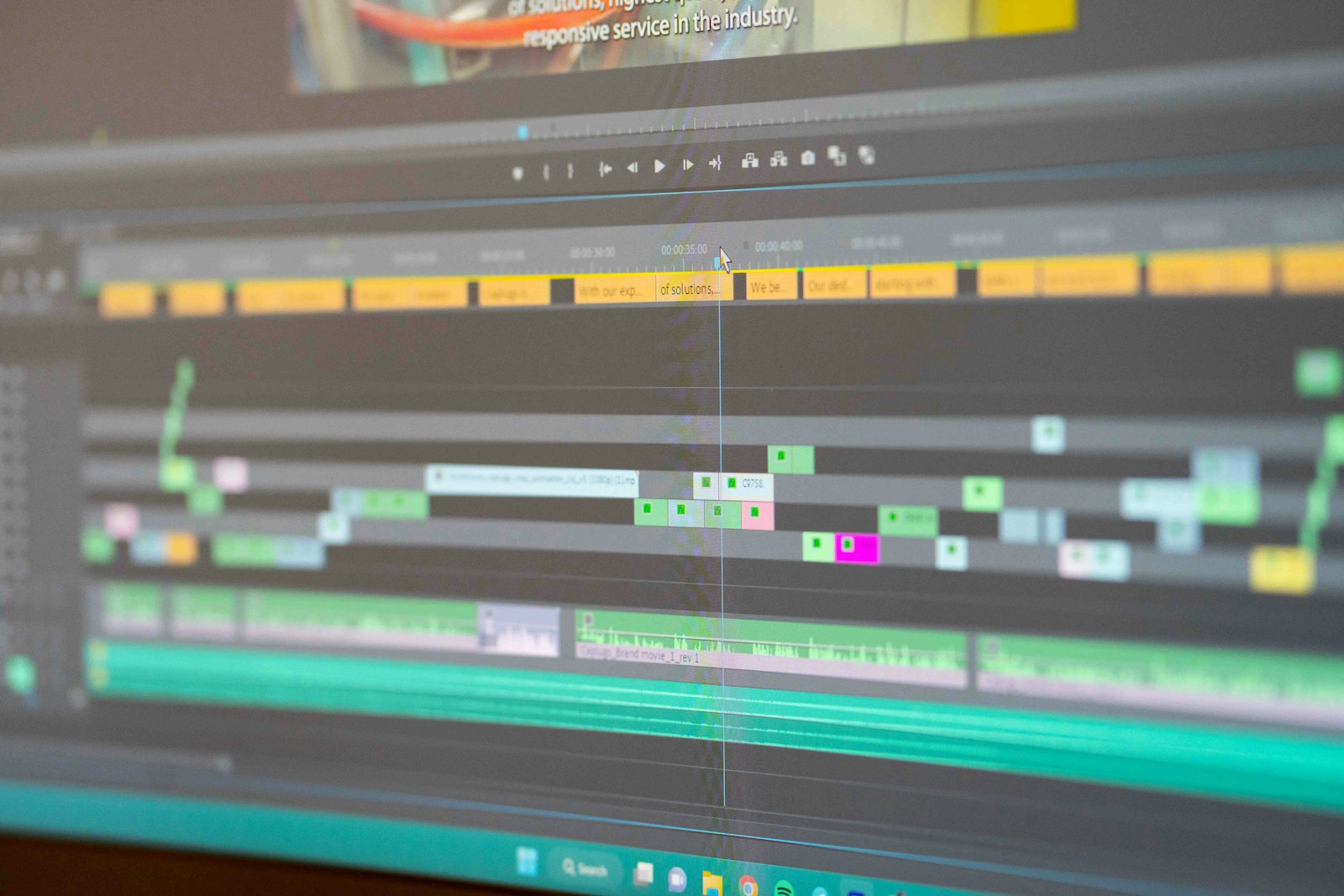
The AI caption tools have effectively standardized these techniques, which is why so many short-form captions now share a look: heavy sans, hard outline or highlight box, animated word emphasis, one or two lines. The animation is the differentiator and the underlying recipe is the legibility fundamentals above, applied automatically. A creator hand-building captions can match the result by following the same three levers rather than reaching for a more exotic font.
How should captions and lower thirds work as a system?
Captions and lower thirds are two roles in one type system, not two unrelated choices. The cleanest creator setup pairs a neutral sans for captions with a related or complementary face for lower thirds and thumbnails, so the whole channel reads as one designed identity. The stack below is the system most creators should start from.
The neutral-sans channel stack
- Captions: Inter or Roboto, bold weight, white with a hard dark outline
- Lower thirds: Inter for the name in semibold, regular for the role line
- Thumbnails: Anton or a paid display cut for the four-word headline
All three faces are free under the SIL OFL except the optional paid thumbnail cut, so the entire system clears commercial monetized video at zero or near-zero cost while staying visually unified.
For the AI-tool side of building captions and lower thirds at speed, our comparison of Captions vs Submagic vs Opus Clip covers the tools that generate these automatically, and our sister desk Nesyona covers the broader AI-tool landscape.
Check the cost across desktop, video, and broadcast tiers before you commit.
Run my license check →
Do caption fonts need a special license?
Burned-in captions and lower thirds almost never need a broadcast license for standard online video. Once the type is rendered into the final video file, it is motion-graphic use, which most foundries cover under a desktop license, and OFL fonts cover for free. The broadcast tier only enters for traditional television and theatrical distribution.
This keeps the in-video text in the same simple licensing zone as thumbnails. For the full tier breakdown and the exact triggers that force an upgrade, our desktop vs webfont vs broadcast license guide is the companion, and the creator-workflow view lives at our sister desk LensPOV.
The Marquee, weekly
One email a week. New title-design pieces, a licensing watchlist, and the AI typography tools worth watching.
Frequently asked questions
What font is best for video captions?
A clean humanist or neutral sans with open counters and a tall x-height is best for captions. Inter, Roboto, and Helvetica-class faces read fastest because captions are scanned in motion, often on mute, on a small screen. A heavy enough weight plus a contrasting outline or box behind the text is what keeps them legible over moving footage.
What font do news lower thirds use?
Broadcast lower thirds favor neutral grotesque and humanist sans faces with strong legibility at small motion size, often a custom or licensed cut of a Helvetica-class or Frutiger-class typeface. The priority is instant readability and a tone of authority, which is why ornament is avoided in news lower thirds.
Should captions and lower thirds use the same font?
They can, and a single clean sans used for both keeps a video looking unified, but they do different jobs. Captions prioritize raw legibility for continuous reading, while lower thirds can carry a touch more brand identity since they appear briefly. Pairing the lower third with the channel's display family and keeping captions in a neutral sans is a common, clean system.
Do caption fonts need a broadcast license?
For standard monetized online video, no. Burned-in captions and lower thirds rendered to the final video file are treated as motion-graphic use under a desktop license for most foundries, or are free under the SIL Open Font License. Traditional broadcast television and theatrical distribution is where the broadcast tier becomes necessary.
What to read next
Sources
- Google Fonts. Inter specimen. fonts.google.com verified 2026-05-29
- Adobe. Font licensing. helpx.adobe.com verified 2026-05-29
- SIL International. SIL Open Font License. openfontlicense.org verified 2026-05-29
- W3C. WCAG 2.1 contrast minimum. w3.org verified 2026-05-29